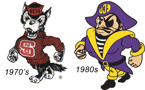
via @NCStatefooball twitter
*****
Click here for original post and background information.
LRM Comments:
The design itself doesn’t bother me. I’ve seen this decal on cars and I recall commenting several years ago it was a creative idea for ECU to play off Carolina’s mid-court design.
Personally, I think the state of North Carolina flag (if permitted by flag etiquette) or even Tuffy at midfield would have been far more creative, and State fans would’ve loved it.
The main problem is that we seem to keep creating ways to put ourselves in the cross hairs. It shows that whomever is responsible for this doesn’t have a firm pulse on this fan base, or they would have known this would draw criticism from within, because of how it would be viewed externally.
It seems like we keep trying to squeeze our “brand” into some generic marketing template rather than promoting ourselves to ourselves (the “Our State” campaign has been wildly popular for a reason). You know, those of us who don’t need the “NC” to know which STATE.
And a note to all the die hard Carolina fans out there: remember, it’s Tar Heels (two words), not Tarheels.


You must be logged in to post a comment.