Home › Forums › All StateFansNation › New basketball court design unveiled today
- This topic has 17 replies, 16 voices, and was last updated 10 years, 10 months ago by
pakfanistan.
-
AuthorPosts
-
06/23/2014 at 7:38 AM #52823
StateFans
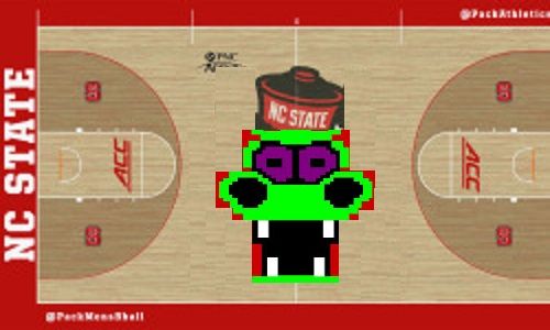
KeymasterNC State will unveil a new basketball court design for both PNC Arena and The Dail Center today. Lots of speculation that the new look will include so
[See the full post at: New basketball court design unveiled today]06/23/2014 at 9:38 AM #52825Wufpacker
ParticipantI predict half of us (give or take) will hate it; the other half don’t care if it’s pink/blue as long as we figure out how to win on it.
06/23/2014 at 10:33 AM #52827WTNY
Participant06/23/2014 at 10:51 AM #52829LRM
KeymasterIf that’s the new court in the video, then it’s LRM-approved — they got this one right.
I think the issue many of us have when new ideas are tried is because our admin has a history of “fixing” stuff that isn’t broken rather than focusing on the real problems keeping the program from moving forward. Style over substance.
06/23/2014 at 10:55 AM #52830eas
ParticipantIf that’s the new design I’m certainly on board with it. Although it’s fairly large I’m happy to see it (if that is indeed the design). They got it right in my book.
06/23/2014 at 11:02 AM #52831pakfanistan
ParticipantI don’t like it. I wish we could go back to something more traditional and old school like pink and blue.
06/23/2014 at 11:05 AM #52832Wufpacker
Participant^ 😀
06/23/2014 at 11:26 AM #52833packbackr04
ParticipantI like it. this should have been the midfield logo as well last yr as opposed to the abomination that was the head in the outline of the State.
06/23/2014 at 11:43 AM #52834Adventuroo
ParticipantI did not see the names, Case, Sloan or Valvano on it. Seems we forget the glorious days of YesterYear and dwell on the not-so-hot triumphs of today.
Lest ye think that I am NOT a loyal supporter of the BB program….I am….I can show you my credit card charges to the WPC and also my travel expenses as I go to out of town games.
I just would like to see our past honored and hope that it would be an inspiration for the future…
06/23/2014 at 11:51 AM #52835Old MacDonald
KeymasterHow many of you are old enough to remember tic tac dough?
 06/23/2014 at 12:21 PM #52836
ryebread
ParticipantI’ll add in a counter point that is a bit more positive. I like everything but the lanes. 😀
I like the wolf face in the center. I’d have preferred the Strutting Wolf like the women’s court has, but that can almost look cluttered. This is a nice mixture.
When we went with the filled in 3 point area and the additional block S’s, the middle block S just looked too cluttered. It felt like a little kid designed it and got crazy with a block S stamp. I suspect the block S logos inside the arc are used for positioning in the UCLA offense, because I seem to remember Alabama having them as well. I could be wrong though. The point is that with all the S logos in there, we needed something else in the middle.
I also like that this differentiates us a bit. We have an identity problem, at least outside of the state. I can’t tell you how many times I’ve been asked about Stanford. The Syracuse S, while orange, only makes it worse. This is good use of the secondary logo.
I do miss the red lane. The cleared out lane reminds me of the HWSNBN era, where we all but abandoned the lane. It was like we were afraid to be there, so we wanted to pretend it didn’t exist. I suspect HWSNBN just wanted an “old school” look, but I never liked it, nor the basketball played on it.
I’m glad we didn’t add Jimmy V, Case, Sloan, etc. on the court. I really dislike the named court trend and feel like the program is bigger than any one coach. We also need to stop living in the past and move forwards.
And the ACC logo? Well, it is what it is. That one is dictated to us.
06/23/2014 at 1:13 PM #52838rtpack24
ParticipantNot bad however the size of middle court logo is way too large. Why not confine it to the jump circle? Too bad we seem to think changing slogans and logos are going to change results on the field and on the court.
06/23/2014 at 2:11 PM #52840Wulfpack
ParticipantThe school took the same redesign and applied it to the practice facility. Check out a video of Kyle Washington and Beejay Anya reacting to the new design below, courtesy of NC State athletics.
06/23/2014 at 2:42 PM #52841PackerInRussia
ParticipantI like it. Also, I like how in the time lapse video, they come back one day and it’s suddenly finished. Magic.
06/23/2014 at 3:01 PM #52842MrPlywood
ParticipantGo big or stay home.
06/23/2014 at 7:53 PM #52848JohnGalt78
ParticipantThere we go getting the big head again….
06/24/2014 at 8:35 AM #52859Texpack
ParticipantI’m a Block S without the NC kind of guy, but this is tolerable. I’m not sure how the stat people are going to figure that “points in the paint” stat though.
06/24/2014 at 8:51 AM #52860pakfanistan
ParticipantI’m a Block S without the NC kind of guy, but this is tolerable. I’m not sure how the stat people are going to figure that “points in the paint” stat though.
Argh, excellent point. How can you have ‘paint’ with no paint.
Also, paint is a weird word. It’s like pants that just cain’t.
-
AuthorPosts
- You must be logged in to reply to this topic.


