The ACC revealed their new logo today and there are a few things to discuss.
To start off, the ACC was teasing a big announcement for today.
Yet earlier in the month this was making the rounds on Twitter:
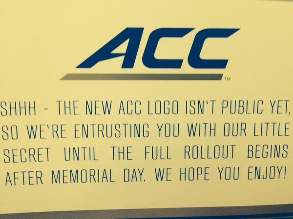
So they spoiled their own surprise. Which was pretty underwhelming the first time, much less the second. Well Done Swofford.
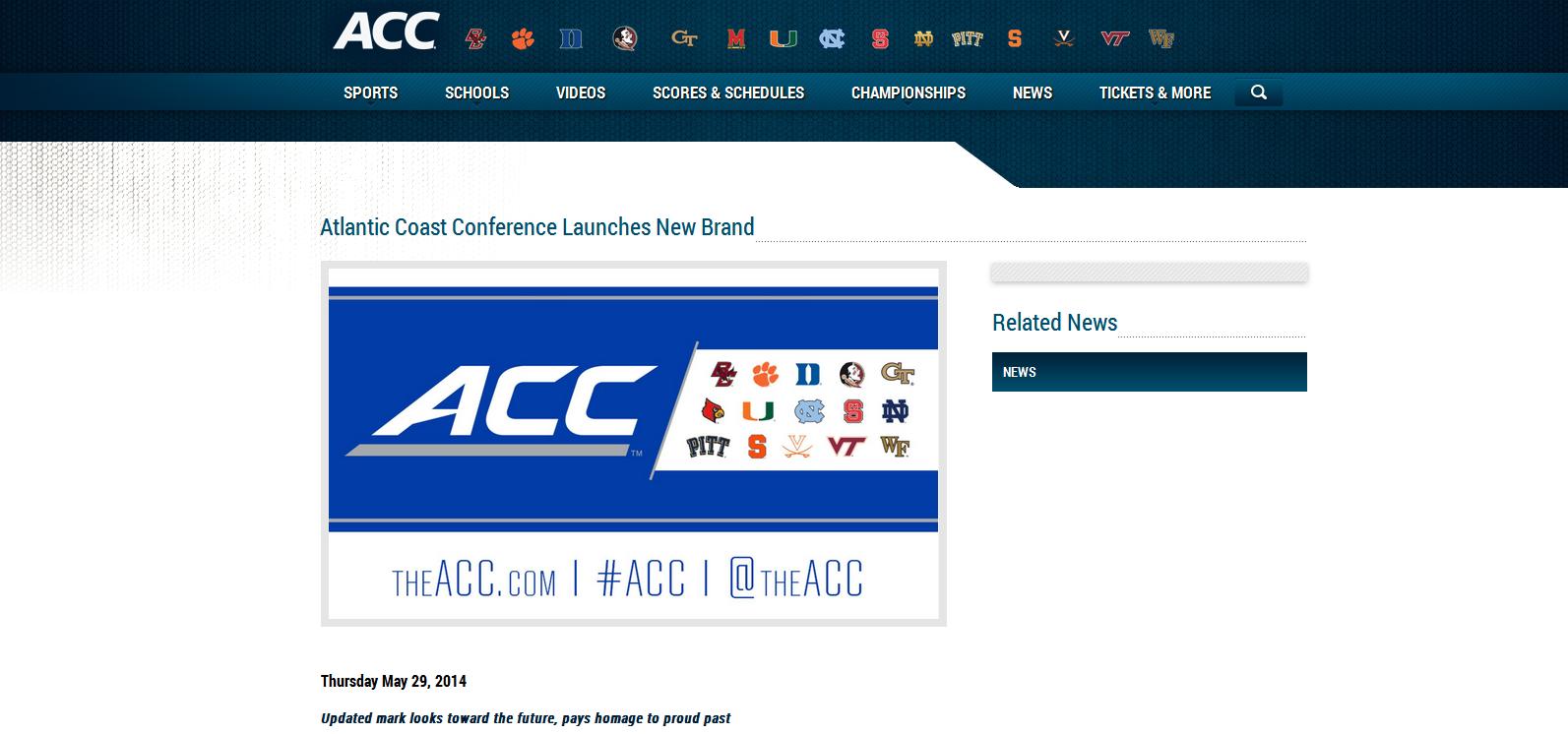
On to the logo itself. The ACC’s website has an article about the launching of their new brand. The website still has the old logo. Well Done Swofford.
Apparently a brand new font was created just for this new logo, “set in a custom-designed font created specifically for the league”
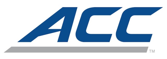
Now let’s compare to the Big East logo

The the fonts pretty darn similar, especially at a glance. Theirs has a pointy G, ours has a pointy A. Well Done Swofford.
There is a 19 page brand book that is about as blowhardy as you can get.
Here is their description of the deep, deep symbolism in the new logo.
The new ACC brand identity strongly expresses the essence of the conference – leans hard into a brilliant future, yet honors the successful path that has led us to this day.
A bold underline has been integrated into the composition as a visual representation of the strong foundation the conference is built upon and as an elevating platform for the future. From the conference’s history of championships, to the addition of esteemed new members and our commitment to stability for the long term, our logo is rooted in our heritage – only faster, sleeker and more contemporary.
Sometimes an underline is just an underline, not “a visual representation of the strong foundation the conference is built upon and as an elevating platform for the future”. Well Done Swofford.
If you thought that was bad, it gets worse:
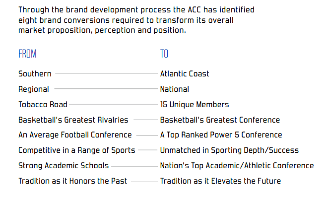
I just don’t even know where to begin with that. Well Done Swofford.
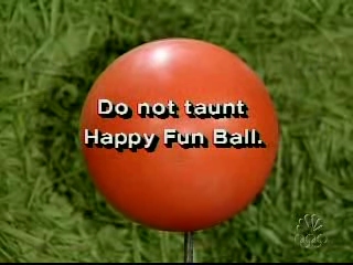
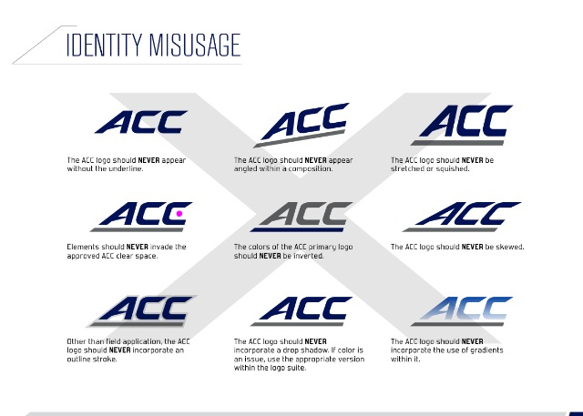
Then there is the 63 page brand standards. The highlight of this has to be what has already been dubbed the equivalent of “do not taunt Happy Fun Ball”
“NEVER invade the approved ACC clear space” (Isn’t that how World War I started? Or something the Romulans did to Captain Kirk?)
And “The ACC logo should NEVER be skewed.” Didn’t say anything about the officiating being skewed. Well Done Swofford.
Feel free to browse though the rest of the buzzwords and business speak that really don’t say very much. It really is impressive how much time and money was wasted on this. Well Done Swofford.
Here’s the NC State version if you care, which you probably don’t:
(If you’re not familiar with Happy Fun Ball you can read up on it here, it is apparently the one video you can’t find on YouTube.)



You must be logged in to post a comment.