It’s (Not) In The Eyes…

NC State recently approved a new logo design by alumnus Jim Cox, a 1966 graduate.  His “Eyes of the Wolf” logo was given its blessing by the university to be sold with its trademarks, even though it will not replace the school’s official mascot, the venerable Tuffy the Wolf.  According to a recent article in the Davidson County Dispatch, Cox wanted a logo with “more intensity.”

“But there’s never been anything with real intensity, nothing gripping,”

Cox would find his inspiration for his dream logo thanks to Moultrie artist Arthur Armstrong and his “eyes of the wolf” painting. Captivated by the print, Cox bought the original and then bought the copyright.

Cox tinkered with the design and said he spent some time figuring out how he would incorporate it into a logo. The end result was the hazy design highlighted with “N.C. State Wolfpack” framed around the wolf. The final design is fairly simple, but an alluring one, according to Cox.

“It’s intimidating — you can get fired up over this,” said Cox pointing to his logo.

For me, that’s where the trouble begins.  Either Cox or Armstrong or both have little understanding of wolves and their characteristics, or they have a different idea of what “intensity” is when expressed by a gray wolf.  Here’s Cox’s design:
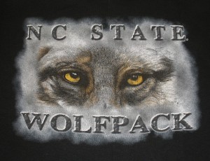
New Wolfpack Logo

Now, compare and contrast that to an actual Grey wolf showing intense aggression:
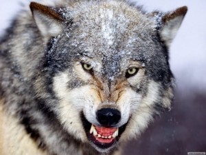
Greywolf

Look carefully at the shape of the eyes – the difference between Cox/Moultrie’s painted rendering and the real thing — the real wolf  display of aggression is far different from the artistic rendering. In short, which wolf would you fear the most, were you to cross them in the wild?

But Why a Grey Wolf Anyway?
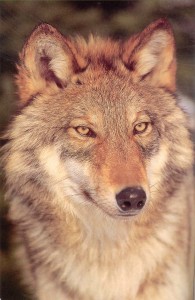
Redwolf3

You will never come across a grey wolf  anywhere in the wilderness in North Carolina.  On the edge of their former territory as it is, they have long been extirpated and unseen in the Old North State since at least the middle of the 1800’s.  There are, however, wolves in the wild in North Carolina, and NC State has been heavily involved in the reintroduction and recovery of wolves in our woods.  The Red Wolf, Canis rufus,  was extirpated here by 1980, but that changed when 100 wolves were reintroduced in North Carolina in 1986 – with critical assistance by NC State wildlife biologists.

In fact, NCSU hosts an Environmental Medicine Consortium web site detailing its Red Wolf efforts:

Dr. Michael Stoskopf , Director of the EMC chairs the Red Wolf Recovery Implementation Team, a group of dedicated scientists in key disciplines appointed by the U.S. Fish and Wildlife Service to provide scientific guidance to the field biologists working to implement the adaptive management plan for the wolf. EMC graduate students Karen Beck and Anne Acton have worked to find solutions to key challenges facing the wolf, and red wolves even live on campus in the EMC’s Wild Carnivore Research Center.

Perhaps it is a mere quibble, but one would think that NC State’s marketing would be aware of one of the university’s noted successes and would be eager to incorporate it into any athletic logo as opposed to a chimerical one that is, well, less than inspiring in my opinion anyway. Today 100-120 red wolves call northeastern North Carolina home and is the world’s only wild population of red wolves.  If you have ever had the pleasure of being in the Pocosin Lakes NWR, the place they call home and hear their howls far in the distance, it will send shivers up and down your spine.

At the end of the day, would it not be better for any new wolf logo not only display a truly “intense” rendering but also reflect the wilderness of our great state and the efforts of NC State’s scientists to protect it?  While Mr. Cox should be commended for trying to bring something new and exciting to NC State, the execution of his design leaves something to be desired and should probably be retooled not only for accuracy but also to celebrate North Carolina and the fine work that NC State’s scientists have done to preserve an important part of our natural heritage.

Campus News General

55 Responses to It’s (Not) In The Eyes…

  1. PackMan97 01/05/2010 at 11:40 AM #

    Is this a joke?

  2. sautz 01/05/2010 at 12:13 PM #

    Mr Cox’s logo reminds me of one of those sad clown paintings. I mean, look at those world weary eyes on that wolf. Considering the last 20 year of Wolfpack athletics perhaps this is fitting.

  3. GAWolf 01/05/2010 at 12:18 PM #

    This looks like a shirt Alan would wear in the Hangover. Take from that what you will… he is a State grad afterall… but I’m talking about the character… not Galafianakas himself.

  4. D_Medlin 01/05/2010 at 12:34 PM #

    “This looks like a shirt Alan would wear in the Hangover. Take from that what you will… he is a State grad afterall… but I’m talking about the character… not Galafianakas himself.”

    And it would be tucked in and surrounded by a satchel…

    Haha

  5. jbwbubba 01/05/2010 at 12:39 PM #

    Not an expert but Red Wolves don’t run in packs I believe, so no “Wolfpack”. Also Red Wolves are known to be rather timid

  6. Alpha Wolf 01/05/2010 at 12:39 PM #

    I didn’t know we had live wolves on campus.

    If that got out, some genius would post a thread on Pack Pride suggesting we drag them onto the field at CFS prior to a football game. Knowing a little bit about the species (I’ve spent time trying to spy them through spotting scopes out in Yellowstone) and their psychological makeup, I can’t think of anything short of physical violence that would be more cruel to the critter. Real wolves are reclusive, shy animals who detest attention. 58K screaming fans would be a living hell for one.

  7. virtualinc 01/05/2010 at 12:41 PM #

    This looks like the logo on a Busch Gardens t-shirt from 1986. Are they kidding? Awful letterspacing on a wannabe-Stonehenge font, the worst Photoshop gradient fade since the nineties, and a doped-up wolf source image. Really ridiculous. It’s this kind of stuff that perpetuates the curse. We need some real, smart design! And real bells in the belltower!

  8. Alpha Wolf 01/05/2010 at 12:43 PM #

    Not an expert but Red Wolves don’t run in packs I believe, so no “Wolfpack”. Also Red Wolves are known to be rather timid –jbwbubba

    ALL wolves are timid and avoid unwanted attention. Unless they have a ‘business’ meeting with you, that is, and you do NOT want to be hunted by a pack of any wolves.

    And yes, red wolves run in packs:

    http://www.defenders.org/wildlife_and_habitat/wildlife/red_wolf.php


    Red wolves are primarily nocturnal (active at night), and communicate by scent marking, vocalizations (including howling), facial expressions and body postures.

    Shy and secretive, red wolves hunt alone or in small packs — complex social structures that include the breeding adult pair (the alpha male and female) and their offspring. Red wolves tend to form pair-bonds for life.

    Size of the pack varies with the size of available prey populations. A hierarchy of dominant and subordinate animals within the pack helps it to function as a unit. Dens are often located in hollow trees, stream banks and sand knolls.

  9. LRM 01/05/2010 at 1:13 PM #

    Gone are the days of us just sitting around as we fail. Now we’ve gotten proactive about failing.

  10. triadwolf 01/05/2010 at 1:16 PM #

    “Red wolves tend to form pair-bonds for life.”

    Is this why Fowler can’t fire coaches?

  11. ncsu05mit10 01/05/2010 at 1:18 PM #

    Or you can choose you side:

    Option 1 — http://www.snorgtees.com/wolfshirtsareawesome-p-827.html

    Option 2 — http://www.threadless.com/submission/108956/The_Infamous_Wolf_Shirt

    I’ll take Option 3 — http://www.snorgtees.com/onemanwolfpack-p-951.html

    Either way, Cox’s design is horrible. Maybe if we start winning, we’ll realize that the block S is perfect. The top programs keep it simple, the lame ones look for energy with bad design.

  12. ncsufan13 01/05/2010 at 2:02 PM #

    I don’t understand how the logo could even be considered. No offense to the artist, but it doesn’t take but 30 minutes to design and complete a similar logo with the same effect as the one he made. It looks like it was made by someone who has never sniffed art school or has any professional experience.

    For example, I made this http://imgur.com/rHqtZ.jpg image in about 15 minutes, using my half-assed photoshop abilities. The fact that our university would approve such an amateur and sorry looking attempt at designing a logo simply so a guy could market some merchandise is sad.

  13. wolfbuff 01/05/2010 at 2:31 PM #

    Guys, if you don’t like it, don’t buy it. Good on the guy for coming up with an idea and following through. Whether it’s going to net him or the university any money will depend on the sales.

    All that said, I agree that there are some natural ties to the Red Wolf being in NC and all. But fact is, the Wolfpack name and logos over the years have been Gray Wolves. And I see no need to change the species of our mascot now. Plus, fact or not, Gray Wolves have a more menacing perception than do Red Wolves. So, let the guy market what he wants, buy it (or don’t) if you want, and/or go market your own design if you want. Just keep it a Gray Wolf.

  14. Lunatic Fringe 01/05/2010 at 2:34 PM #

    I like the idea, but not necessarily the execution of the design. A little retooling of the design and use of the red wolf along with them donating a small portion of the proceeds to the Nongame and Endangered Wildlife Fund for every item sold. It would be a great marketing move for NC State and something that would benefit the state of North Carolina and its Wildlife as a whole.

    One other note – According to the site below all donations are matched by Federal Fund so that actually could add up after a while.

    http://www.ncwildlife.org/give/documents/Postal_Donation_form.pdf

  15. rtpack24 01/05/2010 at 2:43 PM #

    This is sad. The wolf in the logo looks like he is cross-eyed. Not that there is anything wrong with that.

  16. chickenchan 01/05/2010 at 2:46 PM #

    That wolf looks old, confused, and stoned out of his mind…

  17. LRM 01/05/2010 at 2:47 PM #

    So he’s the wolf-version of Lee Fowler?

  18. Sw0rdf1sh 01/05/2010 at 2:54 PM #

    Here is a great shirt suggestion from joeovies via tweet:

    joeovies At this point, anything will work for the Pack. RT @WRALSportsFan: NC State should embrace “Three Wolf Moon” shirt
    http://bit.ly/4ZMjFo
    12:32 PM Jan 4th from TweetDeck

    Hey, it competes with this one….

  19. Cardiff Giant 01/05/2010 at 3:05 PM #

    That thing is completely ridiculous. Sorry, but it is.

  20. McPete 01/05/2010 at 3:37 PM #

    Good thing I already have this design tattooed across my chest, no need to buy a new NC State t shirt.

  21. 61Packer 01/05/2010 at 3:47 PM #

    This thing isn’t a wolf, it’s a friggin’ OWL!!!!!!!!! Can’t we get ANYTHING right when it comes to NCSU athletics? I wouldn’t wish this on Temple, Rice, or even our volleyball team.

    This is yet another example of the total disconnect between NC State University officials and the school’s athletic fanbase.

    I’d like to know if this had to go through our AD before approval.

  22. bradleyb123 01/05/2010 at 3:53 PM #

    In that first logo listed here, the wolf looks like he accidentally ingested some Valium. Dude looks high as a kite!

  23. bradleyb123 01/05/2010 at 3:55 PM #

    ncsufan13, I think I like your “half-assed photoshopped” pic better than the ones at the top of this blog! (Seriously!)

  24. ncsufan13 01/05/2010 at 4:17 PM #

    ^ Thanks. I think its crazy that the abomination at the top of the page wasn’t originally made by Cox, but he actually bought it because he thought it was so aesthetically appealing that he had to have the rights to that image.

    There are plenty of students on campus who could create far more impressive and professional designs than that. I wouldn’t be surprised if he could have gotten someone to make a design for free if he just walked around the art school and asked. The work required to make something like that, as I demonstrated with the pic I posted, is so minimal and amateur that you have to consider that Cox simply got ripped off for purchasing such a badly designed image.

    Thinking about how that made it through the marketing department to be an approved logo makes me shake my head in despair for the way our university is marketed and promoted.

  25. fullmoon1 01/05/2010 at 4:19 PM #

    There is no shortage of bad wolf eye renderings on the web. I just did a google image search. That wolf eye needs a dream catcher behind it to be complete lol and a fanny pack.I, like many appreciate the effort but just like on the court, it takes effort, fundamentals and execution.

Leave a Reply